Custom Websites for Chesapeake Businesses
SEO-optimized, mobile-friendly websites designed to attract customers and drive sales in Chesapeake, VA.
Grow Revenue
Convert more visitors into customers with optimized design
Mobile Optimized
Perfect display across all devices and browsers
Rank Locally
Dominate Chesapeake search results and local directories
Secure & Supported
SSL, backups, security, and 24/7 support included
Lightning Fast
Optimized performance for better user experience
Future Proof
Modern code that's easy to update and expand
What a Real Redesign Actually Does
Six businesses — an eye clinic, a restaurant, a commercial roofer, a wound-care practice, a regional labor union, and a heavy-civil contractor — came to us with sites that looked fine and still weren't earning their keep. Toggle each one to see what we changed, and why it mattered to their bottom line.
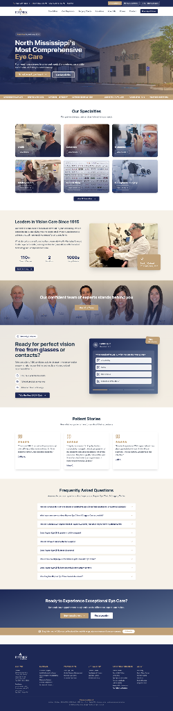
Rayner Eye Clinic
Medical / OphthalmologyThe problemA static 2018-era brochure: the booking button buried, no specialties, no team, no patient stories, and no clear next step.
The redesignRebuilt around one job — book an appointment — with specialties, team, and patient stories that build the confidence to take that step.
Better organic rankings · a smoother mobile experience · more appointment requests through the site.

Sola Osteria
Hospitality / RestaurantThe problemA competent menu-and-hours page where a Michelin-starred story was one paragraph among equals, and nothing made a local feel “this is my place.”
The redesignRebuilt around the brand — Italy meets Ridgewood — with the Michelin-starred chef and the story as the spine, and Uber Eats ordering set inside an experience that already earned the appetite.
Sharper local brand that competes with the big Italian chains · better local visibility · more direct orders.

Schultheis Roofing
B2B / Commercial ConstructionThe problemA capable 35-year commercial roofer presented online like a static template — typos that eroded trust, a stale “25 years” underselling a 35-year legacy, and no clear path to a quote.
The redesignRebuilt around the facility-manager buyer — services spelled out, proof on every scroll, “Get a Quote” impossible to miss, and a content engine for organic visibility.
A site that finally matches the scale of the company · more qualified quote requests · stronger organic rankings.
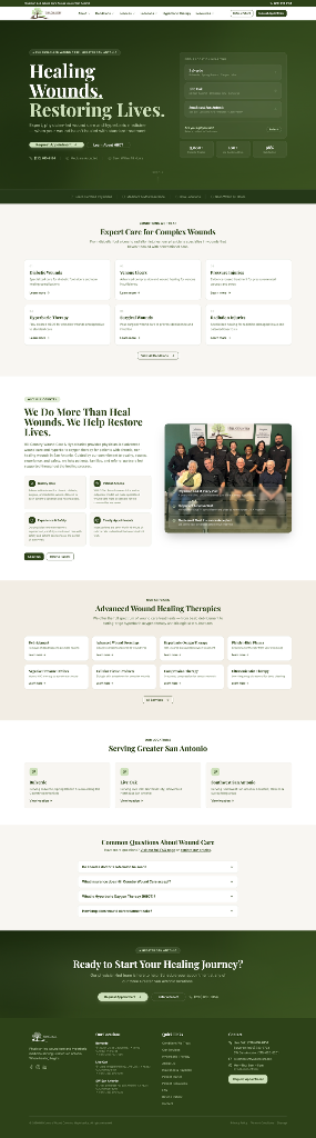
Hill Country Wound Care
Medical / Wound Care & HyperbaricsThe problemA specialist practice that had grown into a multi-location, physician-led system — but whose website still presented it as a single small clinic with one contact form.
The redesignRebuilt around two buyer journeys — referring physicians and patients — with the scale and proof that earns trust, and a structure built to rank for the specific conditions they treat.
More patient and referral appointments · clearer clinical authority · stronger organic visibility for condition-specific searches.
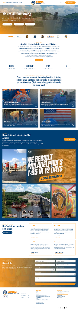
LiUNA Mid-Atlantic
Labor Union / ConstructionThe problemA 40,000-member regional labor union presented online as a static brochure — member value buried in walls of text, training and wages hard to find, and no clear path for a worker in Pennsylvania or Virginia to see what joining actually meant.
The redesignRebuilt around the member journey — “We are 40,000 strong” front and center, with state-by-state entry points, training and wages framed as the promise, and the union’s infrastructure pride made visible on every scroll.
A site that finally matches the scale of the membership · a clearer member recruitment path · stronger visibility across the Mid-Atlantic states.
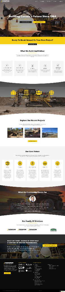
Thompson Construction Group
Heavy Civil / ConstructionThe problemA 60-year heavy-civil contractor presented online as a static grayscale brochure — capabilities lost in a single block of text, divisions buried, and no clear path from “who we are” to “hstart a project.”
The redesignRebuilt around the buyer — “Building Canada’s Future Since 1964” up front, services and divisions spelled out with proof on every scroll, and core values and leadership made visible to back a six-decade reputation.
A site that matches the scale of the company · clearer project-inquiry path · stronger visibility for heavy-civil and infrastructure searches across Western Canada.
Results shown reflect the direction of each redesign's impact. Verified before/after metrics are available on request.